Accessibility of Data.Gov (June 5, 2009; Updated December 2, 2009)
This is the fourth in a series of reports on the accessibility of Obama Administration web sites. I believe that, during the campaign, when then candidate Obama said he wanted a campaign accessible to all, he meant it. Had he known how difficult it was for some people with disabilities to access his campaign web site, he would have insisted it be fixed. Now I think the same for the new administration web sites. They must be, in my opinion, models of accessibility.
Perhaps the biggest problem is this: web developers say sure they know about web accessibility and when told to get it right - they say "yes sir!" There are tens of thousands of web developers and very few experts in accessibility. Perhaps these reports can help developers of other government websites to make their products more accessible to people with disabilities. In other words these reports can supplement the Course here on Section 508 Web Accessibility with real life examples of government websites.
Section 508
Anybody visiting this site probably knows all there is to know about Section 508. That refers to "Section 508 of the Workforce Rehabilitation Act of 1973 as amended, 1998." Under that law, the U.S. Access Board drew up standards for access for information technology that apply to the development and procurement of information technology by all federal agencies and departments. Here is a list of Federal Agencies and Departments". This list does not include the White House, the Congress, or the Judiciary - just for the record. The Section 508 Standards when into effect in 2001. The Access Board empanelled a second Advisory Committee to draw up revised Accessibility Standards; the report of the committee was delivered to the Access Board on April 8, 2008. It is expected that The Access Board proposed standards will be available for public comment sometime in 2010, with those standards taking effect a year or so later.
Accessibility Scan of Data.Gov
As in other recent reports here too I used Worldspace from Deque to perform an accessibility test scan of Data.gov consisting of the home page, Recovery.gov pages linked from the home page, and all pages linked from those. The scan found 100 unique pages with 920 errors or about 9 errors per page. [Update, 12/2/2009 128 pages with 4091 errors - or an average of 32 errors per page.] Below is a table of these errors.
| Error Type | WCAG2 | 6/5/09 # Files |
6/5/09 # Errors |
12/2/09 # Files |
12/2/09 # Errors |
|---|---|---|---|---|---|
| Alt-text on image elements | 1.1.1 | 7 | 74 | 5 | 80 |
| Provide heading markup | 1.3.1 | 2 | 2 | 8 | 8 |
| Provide language of page | 3.1.1 | 100 | 100 | 119 | 119 |
| Titles on Frames | 2.4.2 | 74 | 74 | 57 | 60 |
| Label forms | 3.3.2 | 89 | 670 | 107 | 3824 |
For the home page the Worldspace report shows only three errors - no identification of the language of the page (i.e., English), no headings markup, and one form control lacking a label. We are going to talk about these in a minute. But please note, only three machine detectable errors and there are other serious accessibility issues on the page.
Format of the report
The format of this report is almost the same as what I use when evaluating accessibility of websites for my clients, though I use Word for my consulting work instead of HTML.
Each section of the report starts off with the URL of the page being reviewed, the date of the review, and a screen shot of the page. The table following the screen shot contains the review of that page. Here is a description of the headers of the table.
- # - An item number for reference in the report and elsewhere.
- Issue - Description of the problem or issue.
- Std - Applicable guidelines or standards - Letters refer to the Section 508 provisions, like 1194.22(a). When the letter is prefaced with 21, this refers to the Section 508 software standards, 1194.21. I am including the relevant WCAG 2.0 success criteria - but only ones that are included (with modified wording) in the Section 508 Refresh report of the Advisory Committee.
- Sev - Severity - an indication of how serious I think the problem is. Examples: #1 below has Low severity; alt-text is present but should be improved. The Contrast issue in #7 is assigned Medium severity because it is a priority 2 requirement of WCAG 2.0. The issue of skip links that "don't work" (#4 ) has High severity. I think it is a compliance issue.
- Suggestions - Suggestions for addressing the issue.
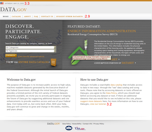
Data.gov
(Reviewed 5/22-23/2009)
| # | Issue | Std | Sev | Suggestions |
|---|---|---|---|---|
| 1 | Active images. All the active images on the data.gov landing page have alt-text. The American flag
on the top left has alt="whitehouse.gov" which is correct since that image links to
the White House site; on Recovery.gov the alt-text is (was) alt="American Flag" which is wrong.
Here three images in the footer link to the data.gov whitehouse.gov and USA.gov; alt="USA.gov
logo" is
wrong in the same way that "American Flag" linking to the whitehouse.gov is wrong, because it describes the
image, it does not give function of the image. |
(a) 1.1.1 |
Low | Use Also no need for verbs in alt-text; link text in the image is "Complete Data Set"; that should be the alt-text instead
of The severity is set to Low here because these errors are common and people expect that "data.gov Logo" will link to the data.gov site. |
| 2 | Large inactive images. Again all the images have alt-text. For those with text, alt-text is text in the image - Good! | (a) 1.1.1 |
Good | |
| 3 | CSS Images. The text just above the search field on the left, "Discover, Participate, Engage" actually is not text; it is a CSS background image and that text is not available to screen reader users. |
(a) 1.1.1 |
OK | However the developers added that text to the alt-text on the image on the right. If you use a mouse to check
the alt-text you may be fooled as I was by the title attribute on that image which does not include
the extra text. (See #5.) |
| 4 | In-Page Navigation (Skip Links). There is one skip link at the top of the page (Skip to Main Content) whose target is just before the images mentioned in #3 - good place for it! The problem is that the skip link doesn't work. Tab to the skip link (check the status area of the browser) - when you find it, press enter. Visual focus shifts which is good. Tab again. You are back at the top instead of being at the first link in the main content. | (o) 2.4.1 |
High | This problem is
an IE bug, which is fixed (I understand) in IE8. However you can fix it for other versions of IE by changing the code
for the target of the link like this: Right now the target is coded like this (naturally):
Also the skip link should be made visible when it receives focus. It is not a big deal for a web development perspective, but provides big help for one who is not able to use a mouse but does not use an expensive screen reader. |
| 5 | In-Page Navigation (Headings). There are no headings marked up on the page though there are clearly a couple of headings that should be marked up as headings. And for consistency it is good to have a heading immediately after the navigation links. | (o) 2.4.1 1.3.1 |
High | Use h2 on "
Welcome to Data.gov" and on "How to use Data.gov". But I think there should be one heading immediately
after the navigation links. So position the left hand heading text, "Discover, Participate, Engage," (see
#3 - remove that text from the adjacent alt-text) off screen and make it an h1. Here's the code you use
for positioning off screen: CSS: .hidden {position:absolute; left:-500px; top:auto; overflow:hidden;} |
| 6 | Form Labels. There are two form controls (select menus) which need to be labeled. They both have
label elements which is good but the first has an empty for attribute. And the text for the label (which is positioned
off screen) is too brief. |
(n) 2.4.6 |
High | Fix the |
| 7 | Contrast. There are three instances on this page where the contrast between text and background does not meet the guidelines. These are (as indicated in the screen shot) the date at the top with a contrast ratio of 3.3 to 1, "orange" menu items with a ratio of 2.9:1 and orange link text at 3.2:1. (Use the Colour Contrast Analyser tool to measure these contrast ratios.) | 3.2.2 | Med | The small text at the top (the date) needs to have a contrast ratio of 4.5:1, and the same for the link text in the middle of the page. The menu items are large text so only need a ratio of 3:1. This can be achieved with color #B74 instead of the current color. |
Data.gov/contact
Reviewed 5/23/2009
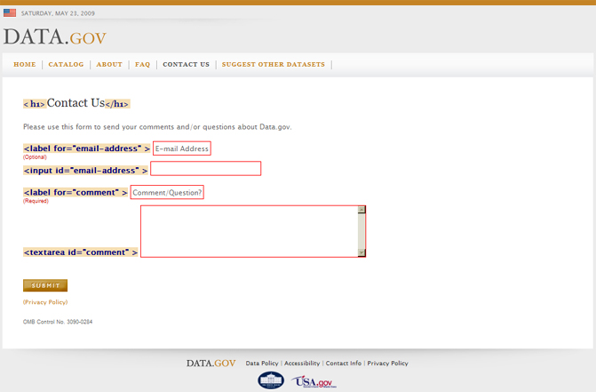
The screen shot above has been annotated with my favelets which are only
slightly different than corresponding functions of the Web
Accessibility Toolbar. Two favelets have been applied, the Form Labels favelet and the Headings favelet. The former
has an advantage over the toolbar in that it will display title attributes if those are used for labeling.
The advantage of WAT Form Labels function is that it does include fieldset and legend. There
is no difference between the toolbar Headings function and my favelet except that I always give a JavaScript
alert summarizing the situation; in this case the alert announces the number of headings found and their levels.
In the report I don't repeat issues from previous pages - for example the skip links and contrast issues are not repeated.
| # | Issue | Std | Sev | Suggestions |
|---|---|---|---|---|
| 8 | Form Labels. The two input fields are labeled with the label element - but the information
of what is required or optional is not included in the label. |
(n) 2.4.6 |
High | Just extend the reach of each |
| 9 | In-page navigation. The single h1 on on "Contact us" is good. | (o) 2.4.1 |
Good |
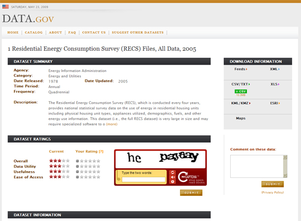
http://www.data.gov/details/10
Reviewed 5/23-24/2009
| # | Issue | Std | Sev | Suggestions |
|---|---|---|---|---|
| 10 | Form Labels. There are two obvious form controls in the screen shot - in the CAPTCHA (more later, #18) and one on the right for comments and that is not labeled | (n) 2.4.6 |
High | Use the |
| 11 | Data tables. There is one data table on this page, the area where you rate the data set
at the bottom left of the screen shot above. The screen shot to the right is this same table with CSS disabled
(with the Web Accessibility Toolbar) and annotated with the Show Data Tables function of the Web Accessibility
Toolbar. There are three ways to associate header cells with data cells (1) use th
on column and row headers, (2) use scope="row" or scope="col"
for row or column headers respectively or finally (3) if all else fails assign an id to each header
and then add headers attributes to each data cell that lists the id's of its header
cells. Any
one of
these techniques would have worked on this simple table. All three are used here. Summary
and the caption which is hidden off screen are OK but too long and burdensome. |
(g) 1.3.1 |
OK | 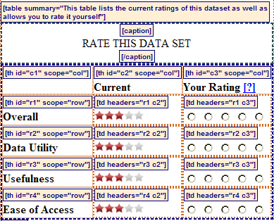 |
| 12 | Form labels. In the Rating table each subject, like "Data Utility" has 5 radio buttons giving the possibility of a score of 1 through a score of 5. These are visible in the screen shot in #11. The radio buttons are not labeled. Also - see #16. | (n) 2.4.6 |
High | Use title attributes on each radio button, like title="1 out of 5" -
a blind user will know they are in the "rating" column. But see #16 below. |
| 13 | Images. The Current Rating in each row is a single image and the alt-text is good, like alt="3
out of 5". |
(a) 1.1.1 |
Good | |
| 14 | Data Tables. There are nine additional tables used for layout on this page that all have
summary attributes, th and even headers attributes. Those are not data
tables, they are layout tables. It is OK to use layout tables, but not with data table markup. |
(g) 1.3.1 |
High | Remove all data table markup (th, scope, caption, summary, id and headers)
from all the other tables. Those are not data tables, they are layout tables. |
| 15 | In-Page navigation. There is one h1 heading at the top of the page - that's fine, but not
enough! |
(o) 2.4.1 |
High | Make each of the white-on-black headings and html level 2 heading, h2 (currently they are caption's
of data tables - yuk!). Also I would make "Comment on these data" an h3 (bottom right). |
| 16 | Keyboard access. The radio buttons to set the rating are not accessible from the keyboard; similarly the information on various feeds, top right, is only available with a mouse. | 21(a) 2.1.1 |
High | All functionality must be available from the keyboard (without a mouse). |
| 17 | Focus. The link to download the data does not change when it receives focus. | 21(c) 2.4.7 |
High | Add a border or similar effect when the image gets focus. |
| 18 | CAPTCHA. This CAPTCHA object is called ReCAPTCHA, it is from Carnegie Mellon University, where the word CAPTCHA was coined. I discussed ReCAPTCHA in my note about CAPTCHAs. The sad thing about reCAPTCHA (besides being a CAPTCHA) is that they don't seem to to test for accessibility. This version is better than the one that I observed for the report I mentioned before, but there are still serious deficiencies. Though the icons (links) for the audio CAPTCHA are in the tab order (they were not in the tab order before), there is no focus indication. For a screen reader the input field is wrongly labeled: "Type the two words; Type what you hear: Incorrect. Try again." Even the first part is wrong because the audio CAPTCHA is now several words. Oh yes the actual CAPTCHA image has not alt text. In this case the alt text should label the image, like alt="two word CAPTCHA challenge." | (n) 2.4.6 21(c) 2.4.7 (a) 1.1.1 |
High | Perhaps the developers of the Data.gov site could encourage the folks at Carnegie Mellon to get this right. But, for grading the data sets, it seems like the CAPTCHA should not be necessary. If some "guard" is needed, try something simple, like "What is 2+2" with an text input field to enter the answer. |
Conclusion
At the bottom of each page is a link, "accessibility". There they mention the use of alt-tags (pretty good) and of skip links (problems, see #4). They also mention the availability of a "text-only site". I found no such link and I hope there is not one in plan because text-only sites are rarely justifiable by the guidelines or standards - and done right, the regular site will be as usable by people with disabilities as any "text-only" alternative..
There are serious accessibility issues indicated here in the three pages that I have reviewed. It seems that some of these (especially the Table markup, #14) indicate that the team is trying very hard but had bad advice. And of course there are other pages that should be examined carefully (especially the catalog).
That examination is easier with the free tools that I have mentioned here, especially the Web Accessibility Toolbar and my Favelets. I also mentioned the Colour Contrast Analyser - but if you have the Web Accessibility toolbar you can just pull the Contrast Analyser off the Colour menu of the Toolbar.
News Items
- Accessibility of MakingHomeAffordable.gov
- Accessibility of Recovery.gov
- Accessibility of the Obama White House website
- Web Accessibility - the book - now in Japanese
- A ruling in the NFB vs. Target Lawsuit
- In-page links and the Internet Explorer Bug
- About Click Here and Other Link Text
- Web Accessibility Toolbar - Version 2.0
- Amazon and NFB sign Agreement
- A decision in NFB vs. Target
- Archived News Items
