Web Accessibility - What not to do
Federal requirements; the Agency home page
Section 508 of the Workforce Rehabilitation Act Amendments of 1998 requires that all US federal agencies make their electronic and information technology accessible to people with disabilities. To achieve that goal the U.S. Access Board published Accessibility Standards in December of 2000; those requirements became effective in June of 2001. The Access Board also published guides as assistance in interpreting the Accessibility Standards.
The subject here is the home page of just one federal Agency. Amongst federal agencies, I would expect this Agency to be one of the most attuned to the needs of people with disabilities. But the Agency's home page stands out as an example of how not to do accessibility. It is clear that the designers of the page knew about accessibility techniques but they didn't have the slightest idea why!
What are the issues?
The Agency home page passes most automated accessibility checks. Where it fails is in the usability of the things that have been done for accessibility.
We would all hope and many assume that accessibility of a web page is a measurable thing. Maybe it is and in that sense the Agency's page is accessible. But it isn't usable by a person requiring a screen reader as we shall see.
The first issue is that almost everything on the Agency page is an image, a picture. There are pictures of people and pictures of text. The fact that there are pictures of text is not a Section 508 violation as such. It is an access usability issue. Guess what happens if you adjust the text size to largest (View | Text size | Largest in IE). Nothing happens! What does this mean? Low vision users may find that they are comfortable reading with the browser text size set at "medium" or "largest." But the setting only works if the text is actual text - not pictures of text - so it doesn't work here. Also screen readers can't speak the words that make up the text in the pictures unless developers include "alternative text" for those images of text.
So we will now forget about the fact that the page is all images - and look instead at how the images are handled. The actual alt-text on individual image links is good; for example, "Health Benefits and Services" is the alt-text for the top-most image - exactly the text that is pictured there. That is what I would recommend. The same is true for the pictures of text down the left-hand navigation area. Alt-text coincides with the text in the image; in effect a blind user will hear exactly what a sighted user sees. Good! How I wish we could stop there, but unfortunately there is more to the story.
Long long long descriptions
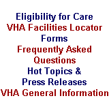
So what's the problem? A big problem is the image of text in the center of the page that appears when you place the mouse pointer on one of the main image links, like "Health Services and Benefits". Here's the image of text that appears when the mouse pointer is over the "Health Benefits and Services Link." (A description of this image is included below.)
I assume that the web team designing the Agency site reasoned that this is textual information that must be provided to users with assistive technology. So the developers added a long description to the Health Benefits and Services image. This is coded with the longdesc attribute on the image. In general, the purpose of the long description is to provide information that is too detailed or too long to appear as an alt attribute. The longdesc is typically used for charts and graphs. The coding on the Agency page looks like this:
longDesc=longdesc.htm#img1
And here is the content of the corresponding part of the longdesc.htm file.
[Header: Selectable Image] The image shows a health care provider taking a person's blood pressure. The text next to it reads, "Health Benefits and Services" The image links to the Health page. That page contains information about eligibility for care, locations of health care facilities, forms, frequently asked questions, hot topics and press releases, general information about the Veterans Health Administration, and an e-mail contact.
Screen readers will ignore long descriptions when they are provided via the longdesc attribute as is the case here. That is certainly a good thing because you wouldn't want to have to listen to that description every time you went to the Agency's home page. And you wouldn't want blind visitors to be forced to listen to comparable essays for each and every one of the eight major links.
The long description itself has problems. It includes useless text like "The text next to it reads" and "Header: selectable image" and it does not accurately describe the image. Here's an accurate and appropriate long description:
Available from the Health Benefits and Services Page: Eligibility for Care, VHA Facilities Locator, Forms, Frequently Asked Questions, Hot Topics and Press Releases, and VHA General Information.
Screen reader users can ignore the contents of the long description, or not as they please. The decision is theirs. The designers of this page had some other plans. I suspect they were worried about the somewhat spotty implementation of the longdesc attribute amongst assistive technologies. So to cover for the possibility that some user might not have access to the contents of the long description, they added an invisible 1-pixel image right next to each main image link and placed all of the long description text as alt-text on the invisible image. Now every blind visitor must listen to every long description whether they want to or not. (There is an accepted way to deal with the spotty support, which isn't spotty anymore, and that is to use a "D-link" - just the letter D that links to the long description text.)
Lots of people navigate pages a link at a time, either with the tab key or from a links list using arrow keys or the first letter of the link text. So maybe there is hope for a person who is blind being able to use this site. At least jumping from link to link should skip these descriptions. Nope! The invisible images (with long alt-text) are links themselves so that the inaccurate long descriptions make up link text (the longest link text I have seen). The descriptions cannot be avoided!
Clearly Identifying Useless Images
Invisible images are often used as "spacer images" to facilitate the layout of the page. These spacer images carry no information. The accessibility technique for dealing with spacer images is to use empty alt-text, alt="", corresponding to no information. Note: this is quote quote, no space, empty alt-text. Empty information equals empty alt-text. In this way assistive technology can just ignore these remnants of the layout process. Not on this Agency home page. Here you find alt="A clear one pixel image for spacing," over and over and over (seventeen times in fact!).
Purely decorative graphics should also have empty alt-text. The Agency home page has some curved images that contribute to the dark blue background of the menu area. The designers of this web site wanted to tell us about them with: alt="A curved image forming part of the menu background" (three times).
Offering a Text Only Site
The information that a user who is blind hears at the top of the page is this:
This Web site works best with the latest version of screen readers. If you have a problem reading this Web page, we have a text only version.
So called "text-only" sites do not pass muster amongst accessibility advocates and developers for lots of reasons, but key here is Section 508 which allows for a "text-only" page only if the original (graphical) page can not be made accessible otherwise. The 508 escape to "text-only" is not available for this home page because it can easily be made accessible as measured by the Section 508 Web Accessibility Standards.
Summaries for Tables
The Web Content Accessibility Guidelines from the World Wide Web Consortium (W3C) recommend that data tables include a summary attribute on the TABLE element to give a brief orientation to the structure and purpose of the table. Since you listen to a table one cell at a time, this orientation information can be invaluable in looking for specific information in an array of data. Screen readers accommodate by announcing the text of that summary attribute as the user enters a table. Summaries are distracting (at best) when tables are not presenting data. On the Agency home page, you hear summary="This table is for formatting purposes only" a couple of times adding to the useless textual declarations on this page.
What can be done?
What could have been done - what can be done to fix the problem? The first thing that should be done is that this Agency (and others) should hire consultants who know accessibility and usability to oversee the agency web development work - especially to oversee the web developer's accessibility work. It's not enough just to tell the developers that your site must be 508-compliant; its important to make sure that they have the experience to understand the effects of what they do. The Agency home page is a perfect example of what happens when well meaning developers don't have a clear grasp of what the accessibility requirements really mean. The designers used the techniques that they were supposed to use: alt-text on images, long descriptions, summaries on tables and text-only sites. I have to believe they blindly used those techniques without understanding why.
The Agency could make the following changes so that the current page would be usable with screen readers while keeping the current visual appearance.
- Use
alt=""on images that don't carry information (about 21 images). - Eliminate the statement about "text-only" at the top of the page.
- Eliminate the long descriptions - both the
longdescattributes and the text attached to invisible gifs. Don't forgetalt=""on those invisible images too. - Eliminate the table summaries.
With the changes enumerated here there would be no representation of the text displayed in the center of the page when the mouse moves over one of the main image links. I think that this text does not have to be represented (long description or otherwise) because when you follow any main image link, like "Health Benefits and Services," you will find an interactive outline (navigation links) of what is to be found in that part of the site. The pop-up of an outline for each main link may work if you can see; it just doesn't work if you have to listen to the material - it looses its effect.
If the Agency made the improvements enumerated above, the Home page would look identical to what it is today. What would change? I looked at the text view of this page with IBM Home Page Reader. (Put focus on the text view, use CTRL+A to select all the text, CTRL+C to copy that text to the clipboard and CTRL+V to copy the text to a word processor.) I looked at it as it is today, and after making the modifications listed above.
Here are the results. There is an 84% decrease in characters in the text view from 4429 for the current page to 698 for the corrected page. There is an 87% decrease in words from 626 to 79. That means it takes seven to eight times longer to listen to the current page compared to listening to the corrected one. I believe the main result of making the recommended changes would be to ensure that the page could be used effectively by a visitor using assistive technology.
Conclusions
It is terribly important to do the things that were attempted for the Agency's home page, alt-text for images, long descriptions for complex charts and graphs, summaries for data tables. It is equally important to do them right:
- Use short and succinct alt-text that conveys the information in the image.
- When an image conveys no information, use
alt="", empty alt-text. - Provide long descriptions for images when short alt-text cannot convey the same information as the image; use the
longdescattribute on the image. - Use the summary attribute on the
TABLEtag to briefly describe the purpose and organization of data tables. - Avoid the use of, or reference to "text-only" sites.
As I said at the beginning, the Agency home page (and I assume the Agency's web site) passes most automated tests for 508 compliance. I usually argue that the biggest worry about testing tools is that they will miss violations of the 508 Standards altogether, like using color alone to convey important information or not having headers and id markup in a table that requires it.
The Agency's home page shows that the simplest of accessibility tasks (alt-text on images) can be executed in ways that seem to software evaluators to be just fine yet leave the page virtually unusable.