Accessibility of Recovery.gov

Continuing to look at Obama administration web sites, here let's check out http://Recovery.gov, the web site set up by the administration to monitor and explain the American Recovery and Reinvestment Act. At the top of this page is a screenshot of the Recovery.gov home page. I will refer to aspects of that screen shot as we go along.
As in my report on WhiteHouse.gov, here too I used Worldspace from Deque to perform an accessibility test scan of Recovery.gov consisting of the home page and all Recovery.gov pages linked from the home page. That report turned up 134 errors on 35 pages, or just a little under 4 errors per page. Below is a table of these errors.
| Error Type | WCAG2 | # Files | # Errors |
|---|---|---|---|
| Alt-text on image elements | 1.1.1 | 2 | 65 |
| Alt-text on area elements | 1.1.1 | 1 | 1 |
| Provide heading markup | 1.3.1 | 32 | 32 |
| Provide language of page | 3.1.1 | 33 | 33 |
| Label forms | 3.3.2 | 3 | 3 |
For the home page, which is the subject of this note, the Worldspace
report shows only two errors - no identification of the language of the page (i.e., English) and no headings markup.
In the former case, the modification is trivial adding both lang="en" and xml:lang="en" to
the
html element at the top of the page. We are going to talk about headings in a minute. But please note,
only two machine detectable errors and there are many very serious accessibility issues on the page.
In-Page Navigation
In-page navigation is a key to an accessible page for people with disabilities. A sighted visitor who uses a mouse can look at a page, focus on a section of the page, read there and and then zoom in to click on a link. If you can't use a mouse to "zoom in to click on a link", and/or if you can't see the page to know which section is of interest to you - its a big problem. When I talk about "in-page navigation," I'm talking about accommodations we can make to facilitate access to parts of the page by people who must use the keyboard to get around including those with screen readers. And those accommodations can make a huge difference.
The requirements for in-page navigation are so simple and so important. All you need to do is mark up section headings on the page as html headings. When that is done a screen reader user can scan the sections of the page using headings navigation (the H key), find the desired section and read or interact there. Without that, a screen reader user is stuck having to read everything on the page in order to find some specific content or some link.
Whitehouse.gov had too many headings. Not only were the section headings correctly marked up as headings, so too were
all the links under each heading, making headings navigation virtually useless. Here it's the opposite, There is
no headings markup. That's not quite true, but we will get to that later. When you look at the home page
there are eight obvious headings. One is at the top next to the feature image, "Building the Recovery"; that
should be an h1.
There are seven obvious headings in the main content of the page, three in the left two columns and four in the right-most
column - they are "obviously" headings because they have common markup consisting of a reddish
brown color and
larger font. These should be marked up as level 2 headings (h2). This headings markup will provide the
in-page navigation for screen reader users, and if you are not using a screen reader, the Opera Browser provides
keyboard headings navigation (S to go next heading, W to go to previous heading). There is more to the story about
the four headings on the right of the page; See "Text Alternatives" below.
Skip Links
In the late nineties we advocated "skip links" - these are links at the top of the page that take you to the main content of the page thereby jumping over all the navigation links. You can read more about skip links here.
Skip links have somewhat fallen out of favor recently for two reasons. First skip links often don't work and second, headings navigation is a better solution for people using screen readers.
But for keyboard users, who are not using expensive screen readers, skip links can be very important. For those keyboard users the skip links must be visible! You can have them visible all the time as on http://webaim.org, or as on this site, only visible when the link gets focus. Try it here on this page. The skip links will appear when they receive focus.
There is a "skip to main content" link near the top of the page. It should be at the top of the Recovery.gov page. It seems to be attached to the American flag which looks like it is at the top of the page but it is not. The text resizing icons, the RSS icon, and the Sign Up fields precede the skip link in the reading order. Not only that, but a screen reader finds two "skip to main content" links there; one that tries to be the skip link and is positioned off screen and the other which opens the White House web site - sort of - see below. I am not joking; this is all real.
Also the skip link does not work. If you tab to the skip link (watch for #maincontent in the status area of your browser) and press enter, visual focus moves as it should, but tab again and focus is back at the top. This behavior renders the skip link useless for keyboard users. There is an easy fix for this too. Here is the way that the skip links should be repaired.
- Make the skip link visible when it gets focus.
- Have the skip link first in the reading order.
- Correct the coding to the White House link at the top of the page with
alt="White House"instead ofalt="skip to main content" - Correct the coding of the target of the skip link so it will work with IE6 and IE7 - the target should look like this:
<span style="position:absolute;"><a name="maincontent" > </a></span>.
Text Alternatives

As I mentioned above, there are four panels on the right side of the page. I have reproduced
one of those here (with alt=""). The problem is that the panel, which looks all the world like
text - isn't text. It is a picture of text. The alternative text, i.e., the value of the alt attribute
on that image on Recovery.gov is all the text in the image. Here it is: alt="Accountability
and Transparency -This is your money. You have a right to know where it's going and how it's being spent. Learn what
steps we're taking to conduct oversight of funds distributed under this law in order to prevent fraud, waste and
abuse." There
are at least two things wrong with that. First, the alt-text is too long, 231 characters including spaces. Second,
there is important semantic information that is lost. The heading, "Accountability and Transparency" is not
announced as a heading by a screen reader. It is just part of the alt-attribute. That important semantic content
is lost. This is a case where the repair is simple and necessary - replace these images with properly formatted text.
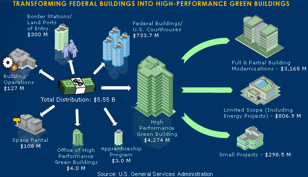
There is another huge problem with text alternatives. At the top of the page is a large image with lots of content
- it is duplicated here on the left (with empty alt-text). The alt text on the Recovery.gov page is alt="Transforming
Federal buildings into high-performance green buildings" which, granted is the title in the image - it does not
convey the information in the image.
In fact, the image is a link and it opens the page, "Building the Recovery", the same that is opened with the "Learn
More" link to the left of the picture. That would suggest that the alt-text should be alt="Building
the recovery".
I think that is correct - but the information in the image needs to be conveyed some place for people who can't
interpret the picture. Some of the information is included in the first paragraph of the Building the Recovery page
- but not all, and that should be fixed.
That image is only one of 5 such graphics that rotate at the top of the page; each is rich in content and in each case the alt-text should say what page will be opened, but the information in the image must be available to people who are blind.
These rotating images pose another problem which is discussed in my note on the White House web site which uses the same rotating image technology. The problem is that text will change while a screen reader is speaking and this is confusing at best. Also there is no obvious way to pick a particular image; who knows what the links, "1", "2", etc. do. As I said there, I am not sure how to solve this problem and encourage suggestions.
There are two minor alt-text issues I found on the Recover.gov page. First, The SIGN UP button at the top of the
page (![]() ) has
) has alt="signup" which
is pronounced "sig nup" and that is confusing at least to me - they are just missing a space in the alt-text.
The other minor error is
alt="arrow" on an image of an arrow ![]() ;
it should be
;
it should be alt="" (no information conveyed).
JavaScript Fly-out Menus
As I explained in the discussion of the White House site, the fly-out menus are not accessible from the keyboard with or without a screen reader so alternative accommodations must be made. The White House has two such accommodations, the footer site map (at the bottom of the page) and the fact that (in most cases) the submenu links are available on the page opened by the main menu item.
Here the structure is much less complicated. Only two of the menu items have submenus, "About" and "Investments". On the page that opens in each case there is a section headed "IN THIS SECTION" (not marked up as a heading) with the list of submenu links there - well they are supposed to be there. For the "About" menu item, there are four submenu links and only two are present in the corresponding "IN THIS SECTION" list. All the links should be there and the heading must be marked up as a heading!
JavaScript Exit Panel
When I talked above about the lack of headings markup on Recovery.gov, I said it was not quite true
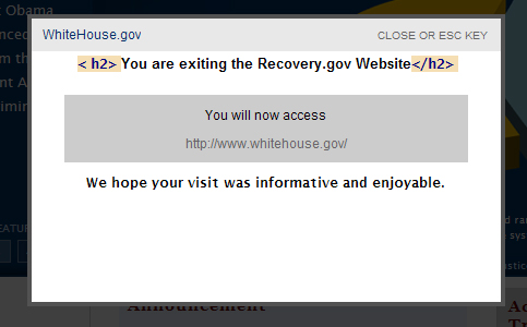 that there were no headings. There actually is one level two heading on a panel that appears when you are about
to leave Recovery.gov; screenshot on the left. (The same situation prevails when you are about to leave WhiteHouse.gov.)
that there were no headings. There actually is one level two heading on a panel that appears when you are about
to leave Recovery.gov; screenshot on the left. (The same situation prevails when you are about to leave WhiteHouse.gov.)
This kind of a JavaScript appearing panel is, as coded, totally inaccessible for a screen reader user. When a screen reader user activates a link that will leave the site, nothing seems to happen because the panel is exposed with JavaScript and CSS; there is no page reload, no change of focus. There is no reasonable way for a screen reader user to find the panel. More importantly there is no information for the blind user that trying to "find the panel" is a reasonable or expected path.
So what can be done about this kind of situation, and of course we all know there are lots of these situations appearing all over the web today. It is fairly simple. Using the same code that displays (unhides) the panel, move input focus to the panel so the screen reader will be start reading there and, if you leave the panel to return to the page where the process started, return focus to that place. And if you think about it - the screen reader user must find the panel to continue with the process they started to leave the site. How discouraging would that be.
In this case, you could make the heading "You are exiting Recovery.gov Website" focusable with tabindex="-1" and move focus there or, I think perhaps better, make "Whitehouse.gov" at the top a link to the White House website and move focus there. That is better because you are at the top of the panel, and have simple access to the CLOSE link and mention of ESC KEY - and if you really wanted to leave, pressing enter right there works. Also in this case, if CLOSE or ESC is chosen, focus should return to the place where the process started. I have seen some other of these panels; and sometimes there is no URL at the top; hopefully that would be changed to include the target URL as a link - that works.
The Timeline Widget
The Timeline widget at the bottom of the page is totally inaccessible to a screen reader user, and difficult to use for anyone who doesn't use the mouse and must interact through a keyboard interface. What is so annoying for me about this is that the information is simply a nested unordered list in one interpretation, listing months and under those, relevant dates, and under those events. Or it is just a list of events, ordered by the beginning date.
At the South By Southwest Interactive Festival in March of 2009, Sharron Rush from Knowbility and Becky Gibson from IBM discussed this timeline in their session entitled AJAX Accessibility: An ARIA Duet. A podcast of the session is available on that page. In particular, Becky provided an example of an accessible timeline built with the Carousel Widget from the Yahoo Interface Libra ray. Both screen reader and keyboard users can navigate to the panels and arrow through them. Within a panel, however, I can't see how a keyboard user would scroll down (when necessary) or how a screen reader visitor can use reading keys to explore the data.
Contrast
There are several instances of inadequate contrast on the Recovery.gov home page. All instances of normal text should have a contrast ratio of at least 4.5:1, while larger text, 18 pt or 14 point bold, needs a contrast ratio of at least 3:1. Test with the “Colour Contrast Analyser” application (a great tool), http://www.wat-c.org/tools/CCA/1.1/. You can also just pull the tool down from the Color menu of the Web Accessibility Toolbar when you need it. That’s what I do!
 This and other similar text
in the header has a ratio of 2.4:1. It should be raised to at least 4.5:1.
This and other similar text
in the header has a ratio of 2.4:1. It should be raised to at least 4.5:1. In the footer
the text has a contrast ratio of around 2.9:1 and and again it should be at least 4.5:1. You can experiment
with colors using the Contrast Analyser.
In the footer
the text has a contrast ratio of around 2.9:1 and and again it should be at least 4.5:1. You can experiment
with colors using the Contrast Analyser. This
in the center of the page has a ratio of 3.9:1 which would be OK for larger text – for this it should be at least
4.5:1. For example, text color #34608E gives a contrast ratio of 5.9:1 – #34608E is the background color in the item
numbers 1 through 5 in the feature images at the top.
This
in the center of the page has a ratio of 3.9:1 which would be OK for larger text – for this it should be at least
4.5:1. For example, text color #34608E gives a contrast ratio of 5.9:1 – #34608E is the background color in the item
numbers 1 through 5 in the feature images at the top.
By the way, I mentioned that the Worldspace tool only caught two machine detectable errors on the Recovery.gov home page. These contrast issues are machine detectable errors for real text and they are not caught by Worldspace or any other tool that I have seen, including aChecker from the University of Toronto and aChecker has implemented WCAG 2.0.
Labeling Forms
Like the White House site, the form controls are labeled with the title attribute which is just fine,
but in the case of the fields at the top of the page, the title attributes are inadequate, title="enter
your email address here". What are you entering your email address for. That is really important. Also the title attribute
should be succinct - so use: title="email
address for updates", and title= "zipcode for updates".
News Items
- Accessibility of the Obama White House website
- Web Accessibility - the book - now in Japanese
- A ruling in the NFB vs. Target Lawsuit
- In-page links and the Internet Explorer Bug
- About Click Here and Other Link Text
- Web Accessibility Toolbar - Version 2.0
- Amazon and NFB sign Agreement
- A decision in NFB vs. Target
- Archived News Items
