Accessible Forms
Forms consist of a number of possible input or interaction elements including the following.
- Push buttons,
inputelements withtype="button",type="submit",type="cancel"ortype="reset". - Image buttons,
inputelements withtype="image" - Generalized buttons,
buttonelements - Text entry fields,
input type="text"ortype="password"(or no type) andtextarea - Radio buttons,
inputelements withtype="radio" - Check boxes,
inputelements withtype="checkbox" - Select menus,
selectelements
Several of these are collected in a form element along with other content including images and text. Usually form elements contain at least one submit button (button or input type="submit").
The accessibility issue for forms is whether or not users with disabilities, especially those who are blind or visually impaired, can determine the purpose of a specific form control and interact with it. A screen reader user will be aware that a text entry field has focus, or a text area or check box,, but may not know what information to type there or what is being agreed to with the check. Screen readers try to guess which text corresponds to the on-screen prompt for a given control. Often they guess correctly, but sometimes they are wrong. That is the problem. Being correct most of the time is not good enough for filling out forms on the web.
The Section 508 standards include the following provision that applies to forms. Unlike other standards that prescribe specific actions, this rule states that forms must be accessible and leaves it to web authors to implement that accessibility.
§1194.22 (n)
When electronic forms are designed to be completed online, the form shall allow people using assistive technology to access the information, field elements, and functionality required for completion and submission of the form, including all directions and cues.
We'll go through each of the interaction elements that can appear in a form and discuss how to make them accessible and compliant with §1194.22 (n). For one of these input elements, push buttons, the accessibility issue is resolved by default. For the rest, you will have to provide some help for disabled customers.
Push Buttons
Push buttons, input with type="button", and input with type="submit" include
the value attribute,
which is the text that is placed on the button, like "submit, "search," or "go." That text is immediately available to
assistive technology.
<input type="submit" value="go" />
When a user tabs to this kind of a push button, the button gets focus (a dotted focus rectangle surrounds the button
text).
And when the button has focus, the screen reader or talking browser knows to announce the text on the button, that text is
the value of the value attribute. In the example above, this value is "go." As a web developer, if you didn't
put a text string on the submit button (no value attribute) then the browser will fill in text, either "Submit" or "Submit
Query" depending on the browser.
<input type="submit" />
The special case of input with type="button" is kind of fun. If you don't provide a value for this button, no one, blind or sighted user will know what you intend:
<input type="button" />
That is not likely to be a mistake you will make.
Image Buttons
Image button accessibility is provided by adding alternative text as explained for images and image maps in the
Section 2 of this course. The input element
with type="image" must include the src attribute for the image source and alt attribute
for the alternative text.
<input type="image" name="Go" src="go.gif" alt="Go" />
Remember, if the button has text, use that text for the alt-text. Doing otherwise is not a critical error or
violation of the guidelines but it can cause confusion. For example, the button below from target.com had alt="Proceed
to Checkout" at
the time that NFB brought suit against the Target Corporation (https://jimthatcher.com/law-target.htm).
Imagine a telephone conversation between a sighted support person and a blind customer, with the support person saying "click
on the Continue Checkout button"; the customer
responding,
"there is no Continue Checkout button" because the screen reader reads it as "Proceed to Checkout."
Generalized buttons
The button element is a container that allows both images and text on a button. Images must have alt-text
as we discussed in Section 2. The following is a rather ugly example.
<button name="submit" type="submit" />
	<strong>Go</strong> <img src="nextarrow.gif" alt="Next page" />
</button>
When the text carries the message of the button and the image is redundant, then alt="" is good
for the image. In the example above, alt="next page" was chosen for the alt-text
so for assistive technology the button reads "go
next page" which is more information than a sighted user would get.
When a button receives focus, assistive technology knows to announce the content of that button including alternative text on image buttons.
Text Entry Fields
One of the most frustrating things about the web for a blind user is encountering a text entry field, and not having the foggiest idea what information to type into that field. This is not only an issue for screen readers and talking browsers. People who use magnification software, especially at magnifications greater than 4x, have difficulty finding the prompt for text entry fields because of the limited amount of data that fits on the magnified display.
If there is no labeling of the text fields, like that we're going to discuss now, screen readers will do their best and guess at what the prompting text is. They will guess by looking at what text that is close by. Usually they get it right, say even 80 or 90 percent of the time. Sometimes they say nothing; sometimes they announce the wrong prompt. But when it comes to filing out forms on the web 80-90 percent accuracy is not good enough. Follow the techniques that we will describe now and you can be sure that assistive technology will present your form to the disabled user with clarity and accuracy.
Make Sure Labels are Close to Text Fields
As we stated above it is very important to be certain that the text of a prompt
is close to the text entry field. It should be just above or just to the left. The prompt should be "physically close," as
measured by pixels but it is best if it is also close in HTML terms, without intervening structural elements. This is not
the solution for screen readers, we will talk about label elements and title attributes below. This is for screen magnification.
When the prompting information is close to the control, a screen magnifier is more likely to enlarge that information along
with the control.
Below is a sample form in a table which has two rows three columns. Here the prompts are close in pixels but not close in structural terms since there are intervening structural elements.
| First Name | Middle Initial | Last Name |
|---|---|---|
This form is read like this with IBM Home Page Reader.
(Start of form 1.)

Form in Horizontal Table

First Name

Middle Initial

Last Name

[Text.]

[Text.]

[Text.]

(End of form 1.)
The first row of the table is read then the second row and so on. Sure it is possible to figure out that the
third text entry field is the last name. But when a user is in the middle of listening to the page, and perhaps tabbing
back and forth, it is difficult at best to figure out which prompt goes with which entry field. The critical idea is
to programmatically connect the prompting text with each input element with the label element
that we will discuss below.
What About the Prompt in the Text Entry Field?
Some recommend putting the prompt actually inside the text entry field. It can't be any closer than that!
This is very helpful to everybody using the form. Both sighted and visually impaired users can easily focus on the input box itself; if the prompt is there the required action will be obvious.
Here is a sample:
And, the corresponding HTML:
<input type="text" ... value="search words" />
The critical disadvantage of this technique is that the default text must be erased before the required data can
be entered. (Erase the default text using the Delete key with Internet Explorer, because the text is highlighted; Shift+End,
followed by Delete for Netscape Navigator because the text is not highlighted.) In the first version of the this Tutorial,
I recommended this technique. I don't anymore because it is difficult to erase that default text. In addition, after
an entry is entered into the input field, a user may tab away and then return. Now the prompting information is gone. Thirdly,
and most important, there is a much better technique supported by all the assistive technologies - in the example above
the title attribute should be used, title="search words" - see more below.
Associate Labels with Elements
In the first version of this web Course I said,
If all assistive technology supported the
labelelement, then this technique would certainly be the first and most important technique for ensuring that your forms are accessible and meet the Section 508 Standards.
Today the label element is supported by assistive technologies. So the label element is the
main technique for making sure that the correct prompt is associated with each form control.
The label element can be used in two ways.
The first way to use the label is as a container of both the labeling text and the form control as in the
following example.
<label>First Name:
	<input type="text" name="fn" size="20" />
</label>
That example has both the first (proximity) and third (label) techniques applied to it; the prompt "First
Name" is
close to its text entry field, and the prompt is programmatically identified to be "First Name" with the label element.
Unfortunately screen readers have difficulty with this use of the label element as a container and one screen
reader doesn't recognize it at all. So do not use the label as a container. Instead use the label element
with the for attribute
whose value is the id of the input element. The example above now looks like this.
<label for="fn">First Name:</label>
<input type="text" name="fn" id="fn" size="20" />
Notice that an id attribute has been added to the input element and the value of the for attribute
on the label element
is the same as the value of the id attribute of the input. That is the programmatic connection
of the prompting text with the control.
This labeling technique will work with screen readers no matter where the inputs and prompt are positioned. In a web
accessibility class I use a form in which all the prompts are in one table (1 column and 6 rows) and all the controls
are in a second table (also 1 column and 6 rows). Without the label element, screen readers speak nothing
for 5 of the controls and the wrong information for the sixth. When the form is labeled, using the label element,
screen readers speak every prompt correctly.
The form in a horizontal table above (first, middle, last names) is a case where screen readers would get it wrong; they
would not read the correct prompting information. The following HTML code for that example uses the label element
applied to each of the text entry fields:
<tr><th align="left">
	<label for="fn">First Name</label></th>
<th align="left">
	<label for="mi">Middle Initial</label></th>
<th align="left">
	<label for="ln">Last Name</label></th></tr>
<tr><td>
	<input ... type="text" name="Fname" id="fn" />
</td><td>
	<input ... type="text" name="Mname" id="mi" />
</td><td>
	<input ... type="text" name="Lname" id="ln" />
</td></tr>
This is the code for the table we saw above; while it looks the same, now it is accessible.
So far we have seen three techniques for associating prompts with text input fields. The first is to place the prompt close to the input field. That is a good idea, especially for people who can see the screen and who might be using magnification software - proximity really is important. For screen reader users, this technique will usually work, but you cannot be certain just based on proximity that a screen reader will announce the intended prompting information so proximity is not enough.
The second technique,
using the label as a container for both the prompt and the control satisfies the proximity issue and it should work
for screen readers. Unfortunately it is not dependable. Sometimes screen readers get it right; sometimes they don't. That
leaves us with the last technique, using the label element with for and id attributes
to programmatically tie the prompting information to the control. This is totally safe for screen readers. This should
always be used when on-screen prompting text is available (more later about using the title attribute when that on-screen
text is not available).
Radio Buttons and Check Boxes
Radio buttons and checkboxes are similar to text entry fields except that for these input elements, the text should be just to the right.
Checkboxes and radio buttons should be programmatically linked, like text entry fields using the label element
In the example above, the fact that prompts and input elements are in different table cells just adds to
the requirement that those prompts be identified with the label element. Here is the HTML for the second
radio button with the appropriate label element included:
<tr valign="top">
<td align="right">
	<input type="radio" name="user" value="returning" id="r2" />
</td><td>
	<label for="r2">I am a returning customer:</label><
	and <label for="pass">my password is:</label><
	<input type="password" size="30" id="pass" />
</td>
</tr>
The last input field is a password field (type="password") and screen readers can inform the user of that
fact. The explicit labeling with the label element reinforces that association.
Always position prompting information close to and, in this case, to the right
of any radio button or checkbox. And always programmatically connect the prompting information with the control
using the label element
with for and id attributes.
There is another construct introduced in HTML 4.0 that is especially important for radio buttons and to a lesser extent
check boxes. This is the combination of fieldset and legend elements. The fieldset element
is a container that groups form controls, and the legend element gives a name (or legend) to the group. So
the the radio buttons above (male and female) could be placed in a fieldset with the legend, gender. If this is done the
question to be answered by the radio buttons is the legend and that question is programmatically tied to the radio buttons.
Screen readers today will read the legend with
each control in the fieldset which is great for "gender male" and "gender female" but can become tiresome
when the
legend is longer and when the fieldset includes many controls. Here is the way the gender example
looks.
And here is the code.
<fieldset>
	<legend>Gender?</legend>
	<input type="radio" id="m" name="g" /><label for=”m”>Male</label>
	<input type="radio" id="f" name="g" /><label for=”f”>Female</label>d
</fieldset>
So for now screen readers announce the legend for every control in the fieldset. Hopefully that
will be modified in the future so that the legend is spoken for the first control in the fieldset and
there is a simple "where-am-I" type key that would include the legend for any control in the fieldset.
It is possible to obtain very interesting styling of the fieldset/legend code. Check out the Man in Blue web site - http://www.themaninblue.com/experiment/InForm.
Select Menus
Select menus (or combo boxes or drop-down menus) are, for accessibility, similar to text entry fields and all the techniques discussed previously apply to them -- with one notable exception.
The one difference between text entry fields and select menus is that the technique of placing the prompt in the select
menu has less of a disadvantage for select menus. If the prompt is placed in the select menu as the selected (default)
item with, say, a null value (value=)
then the users will encounter the prompt as they Tab to the select menu the first time.
Select your State or Province
The code for this select menu looks something like this:
<select name="ship_to_state" size="1">
	<option selected value="">State/Province </option>
	<option value="AL">Alabama </option>
	<option value="AK">Alaska </option>
	<option value="AB">Alberta </option>
	...
The disadvantage of using a default option in the menu itself for the prompt in this way is that when you make a
selection, move away and come back, the prompt is no longer there. In this example when one tabs away from the menu and
comes back and hears "Select menu Alaska" it is pretty obvious where you are, but if you heard "Select menu
28", then you would have to ask, which
of the numeric fields was that - age or date? So it is much better handle the labeling as in all the cases above.
Use the label element
with the for and id attributes to programmatically connect the prompting information with the
select menu. In part because of the default selected value technique and in part because of positioning, it is often the
case for select menus, more than other controls, there is no prompting text around to capture with the a label element.
We deal with that common situation with the title attribute that we discuss now.
Title Attribute for Form Controls
Search forms often provide an example of controls that lack on-screen prompting text. The screenshot below is cut from the IBM web site (http://ibm.com).

Screen shot of IBM.com search area
The form consists of an text entry field (input with type="text")and an push button
with value="Search". There is likely
to be no question in a sighted visitor's mind, what goes in the entry field, but for a blind user, they would land on the
text entry field and their screen reader would just say "edit" or "edit box" - with no hint as to what
goes there. It is true that continued exploration would give a very good clue ("button search"), but that is
unnecessary extra effort that is completely unnecessary if the title attribute is added to the input element, title="search".
With that, screen readers will announce "Search edit".
It is interesting and a bit daunting that this is not what IBM does. Instead they use an invisible image, place alt="Search for:" which is announced "Search For colon" by JAWS, and warp the image in a <label> tag:
<LABEL for=q>
	<IMG height=1 alt="Search for:" src="//www.ibm.com/i/c.gif" width=1>
</LABEL>
	<INPUT id=q maxLength=100 name=q cM1="0" cM2="0" cM3>
There is nothing inherently wrong with this technique, though it is a kind of "hack". Unfortunately some testing tools
don't yet recognize the title attribute as a valid way to satisfy the forms provision in Section 508 and
I suspect that that is the reason IBM uses this technique.
The label construct is in a sense inadequate because it can only assign text to one form element.
If the prompt is at the left side of a row in a table of input elements, you cannot use the label element
to associate that prompt with each of the form elements in the row (because id's must be unique). If an input element
is characterized by two pieces of text, say column and row headers, then the label element can technically
tie two pieces of text to one control but in my tests of this configuration, none of three screen readers picked
up both pieces of information.
Here is an example of a table of input elements that might occur in a hypothetical web-based tax form.
| Taxpayer | Spouse | |
|---|---|---|
| W2 Gross | ||
| Dividends |
We will discuss accessible tables in the next section. One might hope that table navigation (discussed in the next section) with a screen reader would automatically speak the properly marked up table headers. That would be true when navigating the table in "web mode" or tables reading mode. But a user is going to be listening to these controls in forms mode, not in table reading mode, and in this situation the table headers are not spoken.
The title attribute
for the input elements
provides a simple and clean strategy of labeling in this case. Here is part of the code for the table above with the title attributes
filled in.
<table  cellpadding="0">
...
<th>W2 Gross</th>
	<td><input type="text" size="20" title="taxpayer w2 gross" /></td>
	<td><input type="text" size="20" title="spouse w2 gross" /></td>
</tr><tr>
<th>Dividends</th>
	<td><input type="text" size="20" title="taxpayer dividends" /></td>
	<td><input type="text" size="20" title="spouse dividends" /></td>
</tr></table>
The last few versions of the major screen readers all support the
title attribute on form controls. So when on-screen prompting information is not available or
is dispersed, i.e., when the label element won't work, use the title attribute in the input element
(or select menu, etc.)
to indicate the purpose of the control.
It is important to use the label element if possible, so that visible text is what is heard by screen reader
users. That way, when the text changes, screen readers will hear the change, whereas the "hidden" title attribute
might not keep up with changes.
An example collection of form controls
The following is a screenshot of a section of the page encountered when placing an order on Amazon.
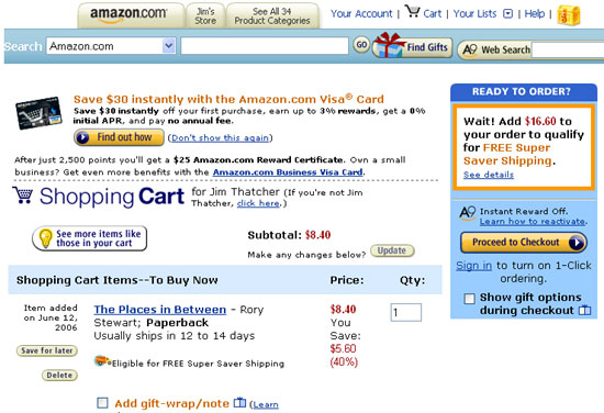
Screen shot of Amazon.com Cart page.
There are five input controls shown in the screenshot of the Amazon.com cart page. If those were marked up correctly as we have discussed in this section, then screen readers would provide the correct prompting information for each control. Because the prompting information is awkwardly placed or nonexistent, screen readers have a tough to impossible time figuring out what to say. Here is a table of how each control should be labeled (the first column), and the way Window-Eyes and JAWS read the form controls in normal "web mode" (columns 2 and 4) and in "forms mode" (columns 3 and 5).
| Form Control - Recommended labeling | JAWS Web Mode |
JAWS Forms Mode |
W-E Web Mode |
W-E Forms Mode |
|---|---|---|---|---|
Comboboxlabel: Search |
Search combobox Amazon.com 1 of 38 | Search combobox Amazon.com 1 of 38 | Amazon.com combobox | Search Amazon.com 1 of 38 combobox |
Text input -title:
search words |
edit | edit | edit box | Search edit box |
Text input - label: A9 Web Search |
edit | edit | edit box | edit box |
Text input -title: Quantity |
$5.60(40%) edit 1 | edit 1 | 1 edit box | $8.40 1 edit box |
Checkbox - label: Add gift-wrap / note |
Eligible for free super save shipping Add gift-wrap / note checkbox not checked | Add gift-wrap / note learn more checkbox not checked | checkbox unchecked | Add gift-wrap / note checkbox unchecked |
Checkbox -label: Show gift options during checkout |
To turn on one-click ordering Show gift options during checkout checkbox not checked | Show gift options during checkout checkbox not checked | checkbox unchecked | Show gift options checkbox unchecked |
The lesson from this table is that you must label all input controls with the label element or with
the title attribute
and if you do that, blind customers can proceed with confidence when interacting with your site, whether searching for
information or entering important personal data like credit cards or phone numbers.
8.8 Summary
Here are the techniques to insure that your input controls meet the requirements of Section 508:
- Always make sure that the prompting text is physically close to the associated form control, either immediately above, or immediately to the left or immediately to the right (depending on the input or interaction element).
- Always use the
labelelement to specifically (programmatically) associate the prompting text with theinputelement when on-screen prompting text is adequate and contiguous. - Use the
titleattribute on theinputelement to specify the purpose of the control if the on-screen text is not adequate or is dispersed.
In Section 10, we will discuss one other very important technique to make your forms accessible. If you use JavaScript
to trigger the forms action, be sure that you use a triggering event that does not require the mouse. For example, do not
use OnChange in select menus which open a new page or refresh the page. With that event, a user may have difficulty
moving down the select menu with the keyboard. Instead, use a submit button adjacent to the select menu. This is accessible
to all.
If you have comments or questions on the content of this course, please contact Jim Thatcher.
This course was originally written for the Information Technology Technical Assistance and Training Center, funded in support of Section 508 by NIDRR and GSA at Georgia Institute of Technology, Center for Rehabilitation Technology. It has been completely revised.